The team
- Product Manager
- Engineering Manager
- 6 Engineers
- Senior Product Designer (me)
Streamlined GRC monitoring — less manual effort, stronger audit outcomes.
Drata’s original compliance dashboard wasn’t meeting the needs of our Compliance Manager persona. Key information was either buried or absent, making it difficult for users to quickly understand their organization’s security and compliance posture.
Worse, some of the data presented could be misleading—creating confusion and risking a loss of trust in the platform. This was a missed opportunity to deliver immediate, actionable insight in a space where clarity and accuracy are critical.
I kicked off the project with a structured discovery phase, dedicating two full sprints to research and exploration. During this time, I led the process end-to-end, while keeping my PM and EM closely involved to ensure alignment and shared understanding. This upfront investment helped us define the right problems and set a clear direction for design.
I started by reviewing existing research across Gong, Slack, and internal documentation to understand what wasn’t working with the existing dashboard. While Drata hadn’t consistently grounded projects in user problems before, I wanted to ensure we were solving the right one.
Through this investigation, I aligned with leadership on a shared definition: a dashboard should highlight what needs attention and make it easy to act. For our Compliance Manager persona—especially in SMB and Mid-Market segments—the primary goal is maintaining audit readiness.
This insight led to a clear hypothesis: We needed an operational dashboard—one that immediately flags issues and enables fast resolution.
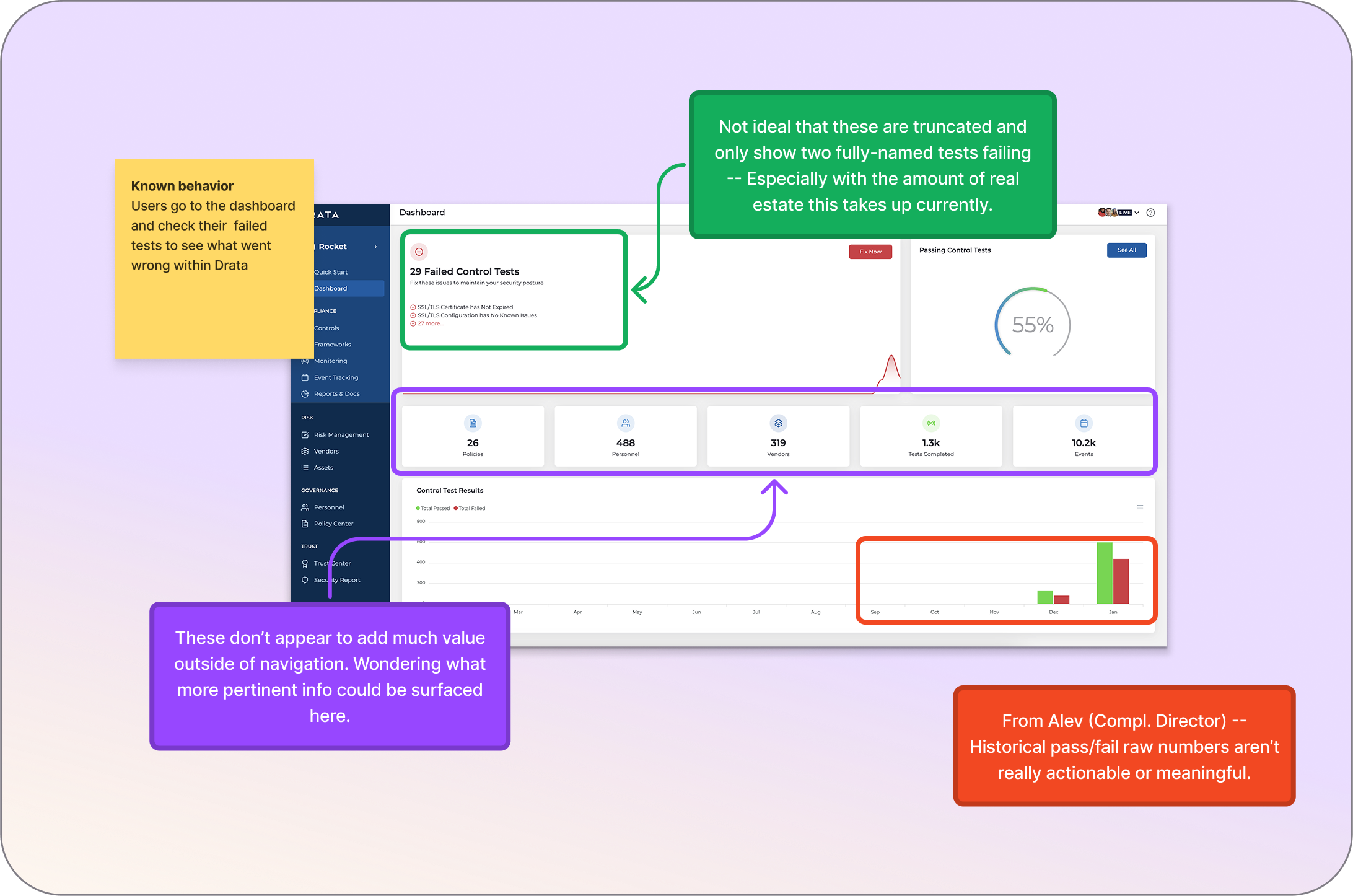
I audited Drata’s current dashboard to evaluate how well it met the core user need: “show me what I need to fix.”
What I found was a largely non-operational experience. Aside from prompting users to fix integrations, most of the content duplicated navigation elements or surfaced low-value metrics—offering little actionable insight for compliance managers.
Following contextual inquiry, I designed and tested multiple dashboard iterations focused on key user jobs:
Each version was reviewed with engineers, internal users, and leadership to ensure alignment and effectiveness.
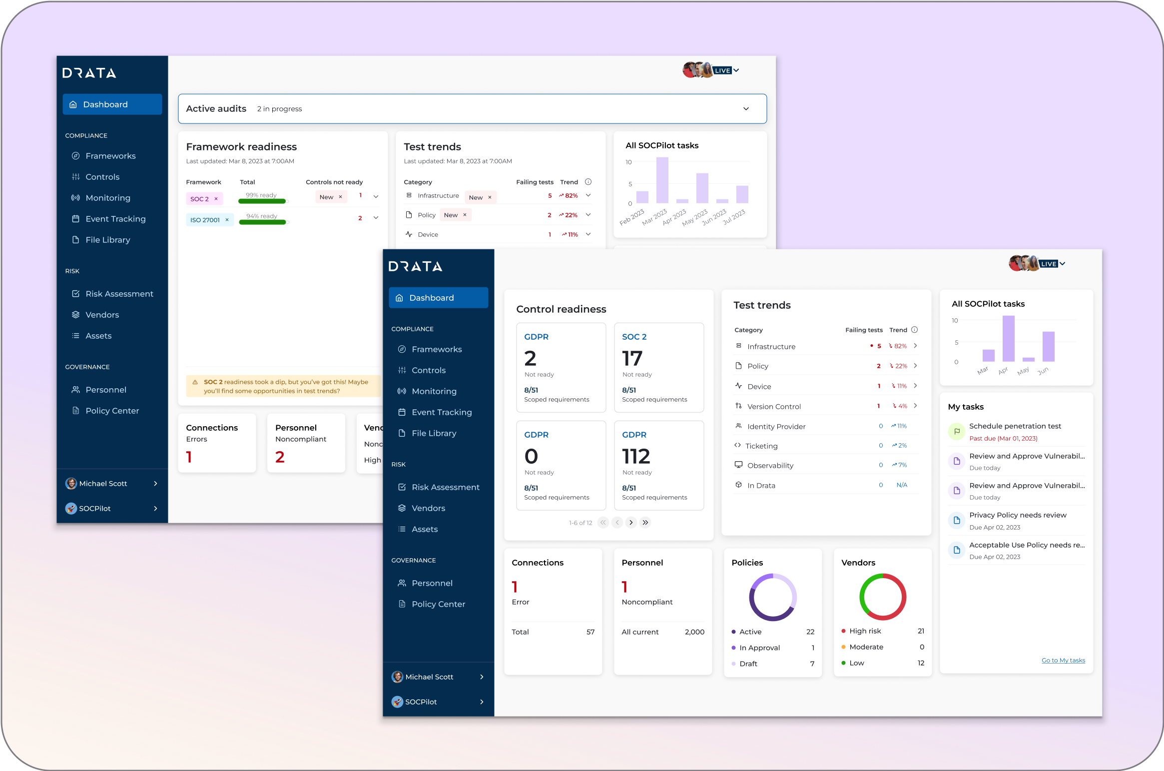
To support the dashboard redesign, I updated and extended our design system — introducing new components, refining visual styles, and ensuring consistency across layouts. These system-level changes not only improved the dashboard experience but also gave our team reusable building blocks that sped up future feature development.
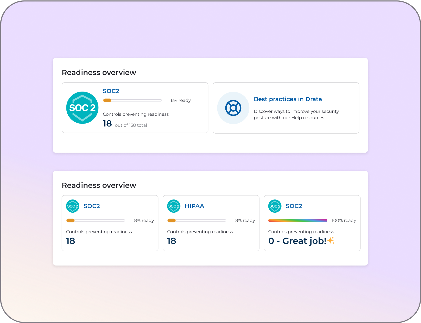
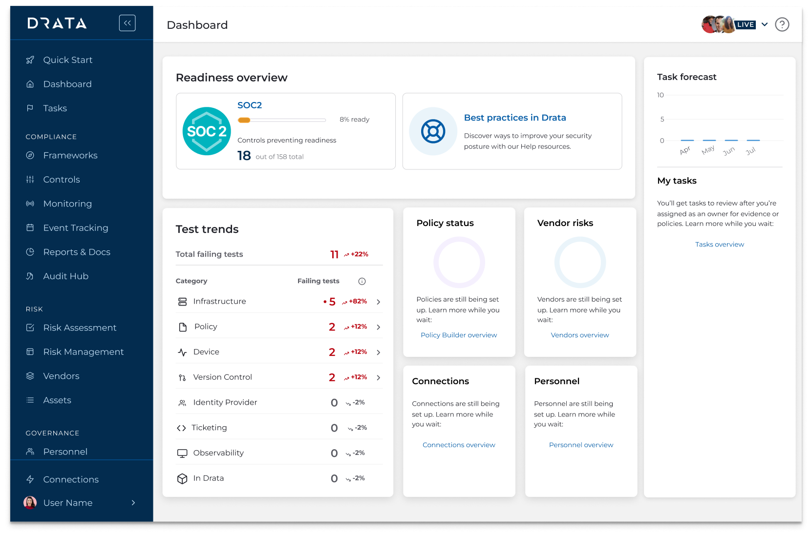
A dedicated section showing real-time progress across compliance frameworks (e.g., SOC 2, HIPAA, ISO 27001). Users can drill down directly into problem areas, with reduced clicks, making it faster to identify and resolve issues that impact audit readiness.

Visualizes current and historical test failures, helping users spot new issues quickly and prioritize them accordingly. Clicking into a failing test category takes users straight to the test details, streamlining remediation and reinforcing a tactical, fix-first workflow.
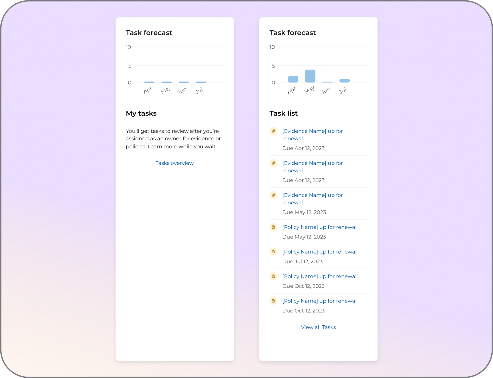
Surfaces upcoming tasks directly on the dashboard, helping Compliance Managers anticipate what’s next without having to dig. This forward-looking view reduces navigation friction and supports proactive compliance operations.
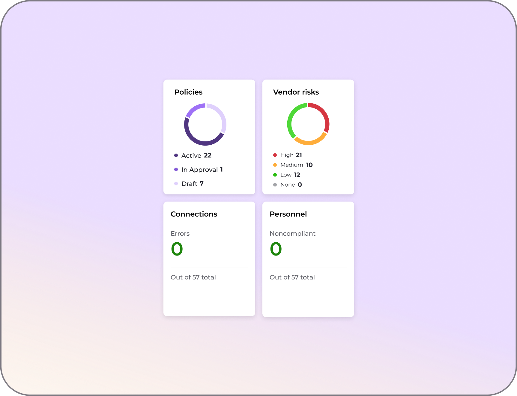
Quick-glance metrics for essential compliance categories—like policy status, vendor risk, personnel compliance, and system connections. Each widget links directly to the relevant section, enabling users to resolve issues with minimal friction.
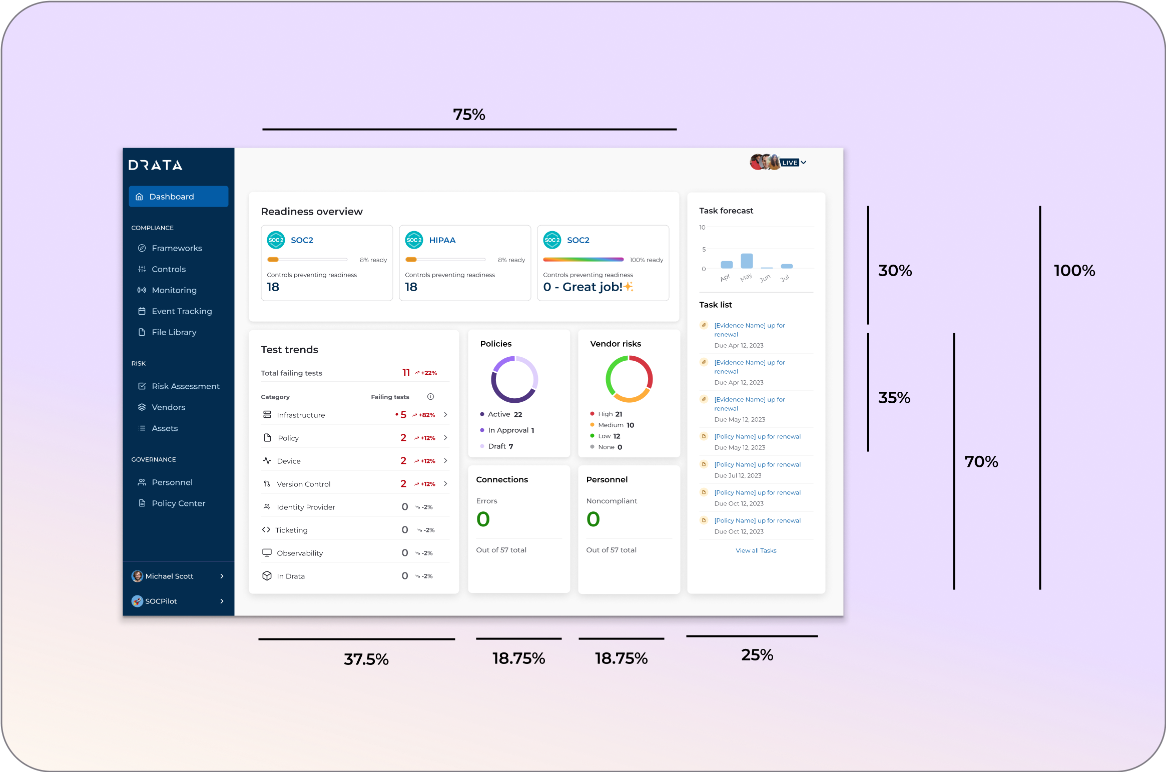
The compliance dashboard was designed responsively to support GRC team members who often check Drata from their phones before starting their day. By ensuring the experience worked seamlessly on mobile, compliance leaders could quickly see priorities, troubleshoot key issues, and decide where to focus — all before opening their laptop.
The redesigned compliance dashboard made it easier for customers to prioritize their work and troubleshoot key problems, a shift that was consistently highlighted in customer feedback. Adoption increased significantly, with usage climbing by 200%, and the experience earned an 8.8 NPS in follow-up surveys — clear signals that the updates delivered real value.
B2B Web App design | CMS | 2021
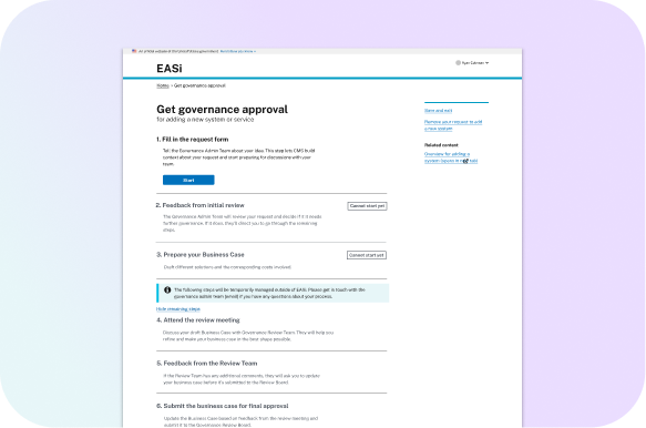
Designing transparency into the system-lifecycle governance process at CMS
Go to case study →